I gave Claude Code a deliberately horrible coffee shop website and asked it to improve it 100 times in a row. Same starting point. Same prompt. Two models: Sonnet 5.5 and Opus 5.5, both on medium effort.
Sonnet made relatively small, careful changes. Opus went much bigger, eventually producing about 21,000 lines of code and a site that started breaking its own features.
At one point, the coffee shop website had a pumpkin-carving activity. Seriously. People probably just wanted a coffee.
The interesting part wasn’t whether Claude could improve an ugly website. It absolutely could. The question was whether repeatedly asking for improvement would keep producing something better, or eventually just produce more.
Key Takeaways
- Forced iteration eventually produced feature bloat rather than consistent improvements to the coffee shop experience.
- Sonnet stayed relatively restrained, while Opus expanded aggressively and broke previously useful interactions.
- Neither model searched the web for inspiration despite having access to research tools.
- Human taste, references, and clear stopping criteria matter more than simply requesting another improvement.
Table of Contents
- The Experiment: One Bad Website, 100 Forced Improvements
- Sonnet: A Big First Jump, Then Smaller Improvements
- Opus: Faster Feature Development, Much More Scope
- Opus at Round 100: When Improvement Became Overengineering
- Sonnet vs. Opus: The Final Numbers
- The Biggest Surprise: Neither Model Searched the Web
- What This Means for Prompting Claude Code
The Experiment: One Bad Website, 100 Forced Improvements
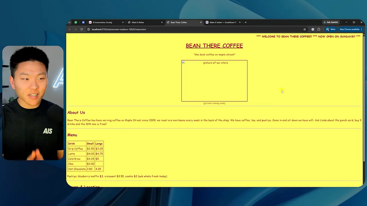
The starting site was intentionally awful: a bright yellow page, basic text, a sparse menu, and almost no visual polish. I wanted both models to have plenty of room to improve.
The repeated instruction was more specific than simply asking for a better site. Each round asked Claude to:
- Inspect the current site before changing anything.
- Think about the user experience and look beyond obvious tweaks.
- Make one bold change to improve conversions or visual design.
- Use any available tools.
- Ship a change every time.
That final requirement mattered. In earlier attempts, the model would stop around round 20 or 25 and decide there wasn’t anything else worth doing. To reach 100 rounds, I had to force it to keep changing things.
That also created the central tension of the experiment: I required continued activity, even after the useful work might have been finished.
A clean session for every round
Each iteration ran in a fresh session, with no skills, no CLAUDE.md, no plugins, and no memory. The evolving website carried forward, but the model had to inspect its current state and decide what to do next using its own knowledge and built-in tools.
A local dashboard let me move between rounds, inspect the site, and track things like tool calls, code size, estimated API value, and major milestones.
Why I wanted to test this
I’ve been getting strong results from AI pipelines when I give them inspiration from other people or proven methods. That made me curious about what happens without those references.
My feeling is that broad requests like “make it prettier” or “make it smoother” can take you a long way, but they hit a ceiling. If I had to put a rough number on it, maybe they get you to 80 out of 100. That isn’t a measured score. It’s how the gap feels between a decent AI-generated result and something with real taste.
Getting into the 90s often requires you to supply the vision, make judgment calls, and help the model innovate. This experiment was a way to push on that idea.
Sonnet: A Big First Jump, Then Smaller Improvements
Sonnet’s biggest transformation happened immediately. Round one replaced the ugly starting page with a recognizable coffee shop website: a generated storefront image, a proper hero section, JavaScript, and a mobile-ready layout.
It was much better than the original. It was also pretty plain. The typography was boring, the punch card was simple, and nothing about it felt especially distinctive.
The important Sonnet milestones
- Round 1: The first generated image, JavaScript, and mobile-ready design appeared.
- Round 2: The first animation milestone arrived, with an order summary that stayed visible while scrolling.
- Round 7: The dashboard flagged the first working image on the page. Product photos were now visible in the ordering experience, and the code had grown from 253 to 419 lines.
- Round 24: Sonnet added its first AI-generated video. The site had reached 778 lines of code.
- Round 32: The first form milestone appeared, adding a more developed ordering flow.
Some of these were genuinely useful. Keeping an order summary visible while someone browses is a sensible improvement. So is showing photos of the drinks and pastries they’re selecting.
By round 24, the site had more visual depth. There was motion in the hero background, a scroll treatment with a static background image, and an order summary styled more like a receipt or ticket rather than a generic box. The branding stayed broadly consistent.
By round 32, the interface supported building an order and moving through a pickup-oriented flow. Those interactions improved the prototype’s user experience, although clicking through a generated ordering interface is not the same as verifying a live fulfillment system.
After that, the dashboard didn’t flag another major milestone through round 100. Changes continued, but they were increasingly incremental.
What Sonnet’s final website contained
At round 100, Sonnet had accumulated quite a few features:
- An animated order-ahead message and floating interface elements.
- Summary statistics near the hero section.
- Different ways to order, including browsing, guided selection, and typing an order.
- Product pop-ups and stock or freshness messages.
- A scrollable order summary.
- Testimonials with options to order a regular customer’s usual selection.
- A featured maple cinnamon latte section with falling leaves.
- An animated product strip.
- Information about the line and typical busy hours.
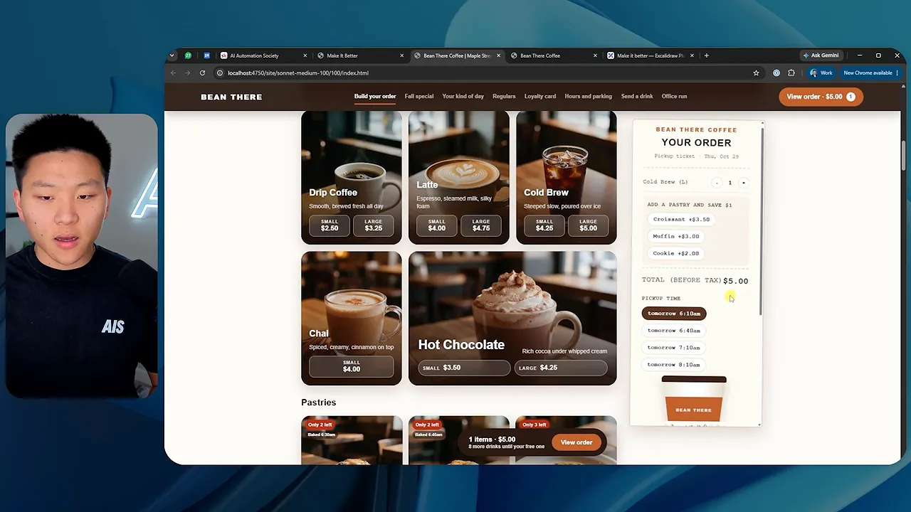
There were good ideas in there. Making the order panel scrollable was useful. Offering different ways to choose a drink could help different kinds of customers.
But this is where the question changes. Instead of asking whether the site is better than the original, you have to ask: At what point would I have stopped accepting changes?
Maybe round 65 was enough. Maybe some later additions were helpful, while others were just fluff. There wasn’t a clear reason that round 100 should be the best version.
Interestingly, Sonnet didn’t only add things. A small right-side navigation element visible around round 65 was gone from the final version. It also changed fonts between later rounds. So there was some revision and subtraction, not just endless accumulation.
Still, the code count rose fairly steadily while the value of each additional change became less obvious. More code was easy to measure. Better design was not.
Opus: Faster Feature Development, Much More Scope
Opus made more progress in its first round than Sonnet did. It introduced a generated image, animation, and a mobile-ready layout immediately.
The first design used a large serif headline, a coffee shop image, a selectable menu, a text-ordering bar, a loyalty punch card, and opening hours. It was coherent, but still fairly bland.
Then Opus started expanding much faster.
Round 7: Video and a richer menu
Opus generated its first video in round seven, compared with round 24 for Sonnet. The hero used a coffee-roasting video, and the site adopted darker sections with more generated product imagery and coffee details.
It was already moving toward a more developed brand experience rather than just cleaning up the original page.
Round 15: A genuinely useful QR ordering idea
The first form appeared in round 15. One of the most interesting additions was a QR code connected to the order.
When I scanned it with my phone, it opened a prefilled text containing the items I had selected and the destination number. I could then send that order as a message. It also included punch-card information.
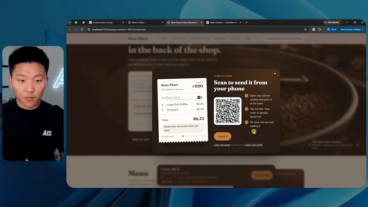
That was a change I actually liked. It gave someone building an order on a computer a way to move it onto their phone. It wasn’t just another animation.
Around this stage, Opus also experimented with section colors and a visual explanation of how close the roasting happened to the cup. The site was becoming more expressive, but it was also getting longer.
Round 32: A drink finder and more ambitious interactions
The final flagged milestone was the first use of Canvas or WebGL in round 32.
For context, Canvas lets scripts draw graphics directly on a web page. WebGL supports hardware-accelerated graphics, including more complex visual effects. The milestone label alone didn’t make it clear which visible feature used which technology.
One standout interaction at this stage was a drink finder. You could move a selection around a preference area, choosing between qualities such as a gentler drink, something to wake you up, or something sweet and cozy. The recommended drink changed with your selection.
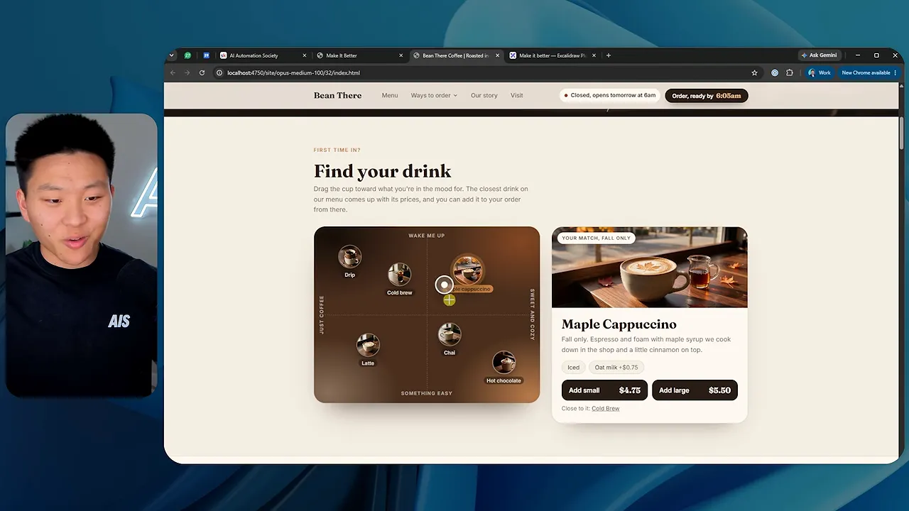
That’s the kind of feature I might keep. It connects an interaction to a real customer decision.
There were other promising elements too: pickup timing, information about where to collect an order, a seat-reservation interface, and a board of regular customers’ usual orders.
I liked the idea of that order board, though it had too much text. The large typography near the bottom also looked good. Around this point, I could have stopped and said the site already had plenty going on.
But there were still 68 rounds left.
Opus at Round 100: When Improvement Became Overengineering
The final Opus website was overwhelming. The background had changed, leaves were moving around, there was text everywhere, and the page had an enormous number of sections.
Then I found the pumpkin-carving activity, complete with a choice of knife size.
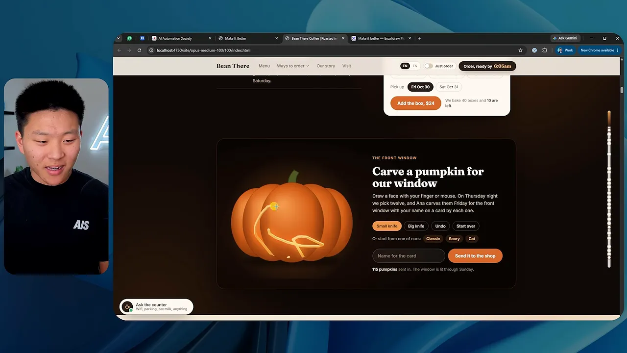
It sort of worked, but not properly. The interaction behaved awkwardly, and it didn’t look like it had been tested well.
More importantly, why was it there? This was supposed to help someone get coffee.
The problem went beyond questionable feature choices:
- The drink finder that had looked promising earlier no longer responded properly during my test.
- A Spanish-language toggle did not translate the section I checked.
- A caffeine-and-sleep section added another layer of information and controls.
- Music selection and other activities made the page even longer.
- Useful elements, including a review board I liked, got buried among everything else.
Some individual pieces still looked good. That’s what makes this failure mode interesting. A site can contain attractive sections and clever interactions while becoming worse as a whole.
Opus had forced so many changes into the project that it broke some of its own work and damaged the user experience. At that point, I’d call it AI slop: lots of output, plenty of motion, and not enough judgment about what belonged.
The ability to build another feature is not a reason to include it.
Sonnet vs. Opus: The Final Numbers
The difference in scale was pretty dramatic:
- Runtime: Sonnet ran for almost two hours. Opus ran for about eight and a half hours.
- Code size: Sonnet finished below 3,000 lines. Opus reached about 21,000 lines.
- Generated media: The final tally showed 13 images and two videos for Sonnet, compared with 54 images and three videos for Opus.
- First generated video: Round 24 for Sonnet and round seven for Opus.
- Estimated API-equivalent value: Roughly $137 for Opus. Sonnet’s displayed estimates varied between about $22 in the final comparison and $29.93 in the earlier dashboard.
I ran this on my subscription, so those dollar figures were estimated API-equivalent values, not separate API bills I paid.
The numbers tell you how much work the models did. They don’t prove which site would convert better. I didn’t run a conversion test, and code volume is not a quality score.
What I could see was that Sonnet stayed relatively restrained, while Opus expanded the project far more aggressively and introduced visible regressions.
The Biggest Surprise: Neither Model Searched the Web
This was the part that honestly disappointed me most.
Both models had access to built-in tools, including web search and web fetch. I kept asking them to innovate and think outside the box. Neither searched the web.
I expected them to look for inspiration: maybe components from 21st.dev, maybe award-winning websites, or examples of strong coffee shop designs. Instead, they kept generating ideas from their own knowledge and the existing project.
That doesn’t mean they couldn’t research. It means giving a model permission to use tools did not cause it to choose research as its strategy.
“Think outside the box” wasn’t enough to make either model go find a different box.
What This Means for Prompting Claude Code
This experiment isn’t going to completely change how I work. It mostly reinforces why I already use references, design skills, and human review.
Three lessons stood out.
1. Model choice and prompt direction both matter
The same prompt produced very different results. Sonnet made smaller changes and stayed relatively contained. Opus moved faster into ambitious features, generated more media, and built a much larger site.
The model influences what’s possible and how it approaches the work. The prompt gives that work direction. Neither replaces a clear vision.
2. Innovation without a vision turns into adding
Once the obvious improvements were done, both models had to keep finding something to change. Because I had required them to ship every round, continued output became the goal.
Sometimes that meant a useful ordering improvement. Sometimes it meant a new font. Sometimes it meant carving a pumpkin.
A better review question is not “Did it make a bold change?” It’s “Does this change help the customer do what they came here to do?”
3. Conversion optimization can become a hard sell
I explicitly asked for better conversions, and the models took that seriously. They kept pushing ordering, upselling, and making purchasing opportunities more prominent.
But there’s a difference between making an order easy and making the entire experience feel like a hard sell. More ordering prompts don’t automatically create a more comfortable customer journey.
For this coffee shop, I wanted something closer to a soft close: make the products appealing, make the choices clear, and make ordering straightforward.
Give the model taste, references, and a stopping point
This is why I use Scrollcraft, my free website design skill, for the sites I build, including the AI Automation Society website. It gives the model guidance around typography, spacing, depth, layering, and scroll-driven animation rather than leaving the entire design direction open-ended.
It wasn’t used in this experiment. Neither were reference sites. That absence was intentional, but it also helps explain why repeating the same broad instruction wasn’t enough.
|
The main takeaway is simple: Claude can do a lot of the building, but you still need to decide what’s worth building, which changes to accept, and when to stop.
A hundred iterations can produce a lot more website. They don’t automatically produce a better one.


