Most AI websites look fine. They have a headline, a few cards, some gradients, and a button. But looking fine is not the same as helping a business get customers.
Web design is one of my go-to tests for every new AI model. After studying more than 10,000 AI websites and helping thousands of students build their own, I keep coming back to five patterns that separate a generic page from a site that actually does a job.
These are the kinds of improvements that can make a website worth $1,000 to a business. Not because it has the most impressive animation, but because it makes the offer clearer, directs attention, and helps someone take the next step.
You can still use AI to do most of the work. The skill is knowing what to ask for and how to review what it gives you.
Key Takeaways
- Write customer-specific copy before asking AI to design the page.
- Use restrained accent colors and layered layouts to make the primary action obvious.
- Give every animation one purpose and respect reduced-motion preferences.
- Offer a useful quiz, estimator, or tool before asking visitors to make contact.
Table of Contents
- 1. The Mirror Test: Make the Right Person Recognize Themselves
- 2. The Highlighter Rule: Use Color to Direct Attention
- 3. Front, Middle, Back: Give the Page Depth
- 4. Motion with a Job: Animate for a Reason
- 5. The Free Sample: Give People a Taste of the Result
- Review the Website Like a Business Owner
1. The Mirror Test: Make the Right Person Recognize Themselves
The first pattern has almost nothing to do with design. It is about the words on the page.
When the right person lands on your first screen, they should recognize their problem, their world, and the outcome they want. The page should feel like it was made for them, not for a vaguely defined group of “businesses looking to grow.”
That is the mirror test.
Start with the customer, not the layout
TruckersReport is a job site where truck drivers can submit one application and receive offers from trucking companies. Its landing page was already converting at about 12.1%, but the business wanted to improve that result.
Before changing the design, the conversion team at CXL surveyed drivers and looked at the data. A few problems became clear:
- About half the traffic came from phones, making the mobile experience important.
- The headline did not clearly explain what a driver would get.
- A generic stock photo of a handshake did not reflect the people using the site.
The team rebuilt the page around the driver. After multiple tests, the new page converted 79.3% better than the original. That is a relative improvement, not a conversion rate of 79.3%.
The lesson is not to copy that page. It is to do the customer work before asking AI to make something beautiful.
Your first screen needs to answer three questions
This is the same idea as the three P’s: the pain, the person, and the promise. Apply those to the first thing someone encounters on your site.
- Who is this for? Make the audience or use case obvious.
- What do I get? Describe the outcome, not just the technology or feature.
- What do I do next? Give people one clear primary action.
Specific language can make a big difference. CityCliq changed its homepage headline from a broad promise about helping businesses grow online to a direct explanation about creating a web page for a business. Click-throughs to its pricing page increased by 90%.
Campaign Monitor tested matching a word in its headline to the language people had searched for, such as “design,” “create,” or “build.” That change produced 31.4% more signups.
Both examples point to the same thing: people should not have to translate your message into their own situation.
For a scheduling product, “AI-powered scheduling” describes a feature. “Fill your calendar without answering DMs” describes a result. The second gives a busy hairstylist a reason to care.
Then give that person an obvious next step, such as “Book your free call.” A clever headline without a clear action still leaves the visitor doing the work.
Before you ask Claude for any design, write your answers to those three questions and give it that context. You will get much more relevant copy than you would from a generic request for a modern landing page.
2. The Highlighter Rule: Use Color to Direct Attention
AI often treats color as decoration. It chooses something that looks nice, then spreads it across the headline, icons, borders, backgrounds, and buttons.
The problem is that nothing stands out anymore.
Think about studying with a highlighter. Highlight one important sentence and you can find it immediately. Highlight the entire page and you have not highlighted anything.
Your website works the same way. Choose one color that stands apart from the rest of the page, then reserve it primarily for the action you want people to take.
I ran into this with the AI Automation Society website. The first version had our blue everywhere, and it looked cheap. Moving back toward black and white, with blue reserved for a few important details, made the whole thing feel clearer and more premium.
Borrow the 60-30-10 rule
You do not need to be a professional designer to create a disciplined palette. A useful starting point comes from interior design: the 60-30-10 rule.
Imagine a living room with pale gray walls and a large rug, a navy sofa and curtains, and a few burnt-orange cushions. The orange works because it is not competing with orange walls, orange furniture, and an orange floor.
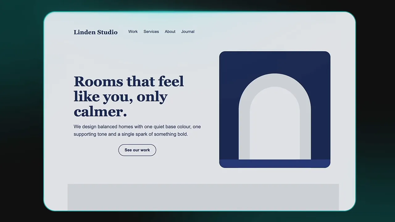
On a website, apply that same balance:
- 60% background: the main color that sets the overall tone.
- 30% structure: text, navigation, cards, and section blocks.
- 10% accent: buttons, important links, and a small amount of carefully chosen emphasis.
Treat this as a design guide rather than a pixel-counting exercise. The point is to establish a clear hierarchy instead of giving every element the same visual weight.
If you want to choose the palette yourself, use a tool like Coolors. Give Claude the exact color codes and tell it which color belongs to each role. Then explicitly ask it to follow the 60-30-10 balance.
Do not just say “make it colorful.” Tell it what the color is supposed to do.
3. Front, Middle, Back: Give the Page Depth
A site can have the right words and colors and still feel cheap. Often, the problem is that everything sits on the same level.
Every box, image, and button looks pressed flat against the screen. There is no clear order for your eyes to follow.
The simplest way to think about this is a stage. A backdrop sets the scene. Furniture occupies the middle. The actors stand at the front. Those layers help you understand what matters.
A website can use the same structure:
- Back: a photo, a soft shape, a block of color, or another background element that creates context.
- Middle: the headline, supporting text, cards, and product content.
- Front: the main action or the element that deserves the most attention.
The AI Automation Society homepage uses mountains in the background, with the timeline, laptop, and text on separate layers. That separation is a big part of why it feels more polished.
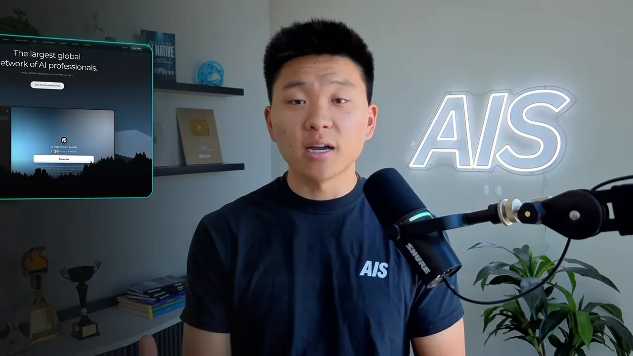
At one point, the foreground tree line covered too much of the laptop area. We cut a V-shaped opening into the trees so the button stayed visible. That is the important distinction: the layers should support the action, not obscure it.
Build depth with three simple changes
- Put something real in the background. Use a photo of the work, the product, or a relevant setting. Even a soft shape can add depth without making the page busy.
- Let one element break an edge. Allow a card or image to overlap the next section instead of keeping everything inside separate boxes.
- Lift only what matters. Use a soft shadow on the primary button or main card rather than giving every element the same treatment.
Go back to the hairstylist example. The background could show the stylist’s chair and work. The middle could contain the headline, “Fill your calendar without answering DMs,” alongside a booking card showing the next available appointments. That card might overlap the next section.
At the front sits one orange “Book your spot” button with a soft shadow. The orange is not scattered everywhere else. Now the copy, color, and layering all point toward the same action.
This is also why I built Scrollcraft, the free website design skill I use in my own builds. It includes guidance for scroll-driven animation, layering, typography, spacing, and depth, so the AI has more design direction to work with.
4. Motion with a Job: Animate for a Reason
Scroll animations are one of the fastest ways to make a site feel expensive. They are also one of the fastest ways to make it look obviously AI-generated.
The difference is whether the animation has a job.
A useful animation might show the product, point toward the next step, or confirm that something happened. If it does none of those things, it probably does not need to be there. If it tries to do five things at once, it needs to be simplified.
It is tempting to make every section fly, spin, and fade. I get it. It is fun. When I redesigned my own site, I added a spinning 3D ring to display some recognition. It looked cool, but it was too much, so I removed it.
A business is not paying for a movie. It wants more customers.
More movement does not automatically mean better usability
Nielsen Norman Group’s UX guidance makes an important point: moving elements attract attention. That can also mean pulling attention away from the task someone came to complete.
A Purdue study compared the same website with and without parallax, where the background moves at a different speed from the foreground. Participants found the parallax version more fun, but it did not improve perceived usability or visual appeal.
Motion is not inherently bad. It just does not earn its place by existing.
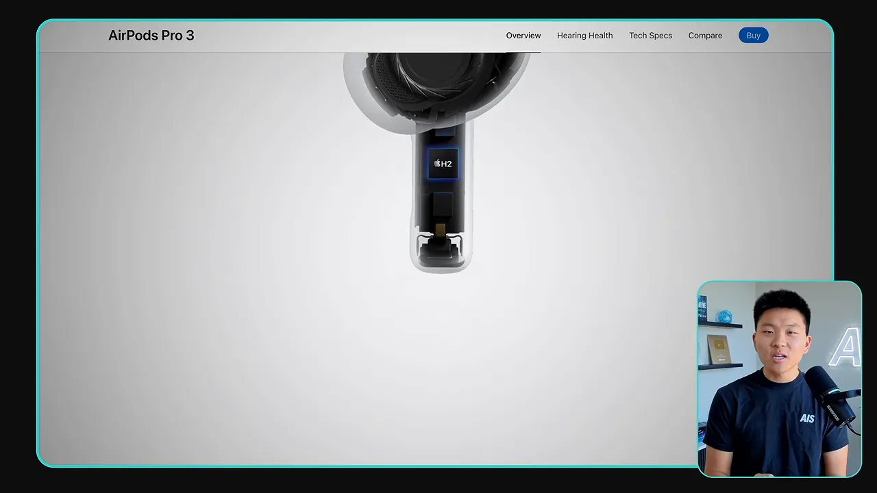
Apple’s AirPods Pro page is a useful example of motion with a purpose. As the page scrolls, the product changes position and angle. The movement helps explain the physical product instead of competing with it. It gets closer to the experience of turning it over in your hand.
Follow three motion rules
- Let one thing move per screen. Choose the product, a result, or a before-and-after demonstration. Keep the surrounding content still.
- Never make people wait for the words. The first screen’s headline, supporting text, and button should be readable immediately. Do not make the offer depend on a long entrance animation.
- Give people an off switch. Respect reduced-motion preferences, and consider a visible motion toggle when appropriate.
That last point is not just polish. Motion can make some people dizzy or unwell. A large US health survey found signs of vestibular dysfunction, involving the inner-ear balance system, in about a third of adults aged 40 and older.
Phones and computers provide reduced-motion settings for a reason. Tell Claude to respect the prefers-reduced-motion preference and disable the relevant animations when it is enabled.
The goal is a site that feels polished without getting between the customer and the task.
5. The Free Sample: Give People a Taste of the Result
Most AI websites explain the offer and then present a contact form. That is not necessarily wrong, but you can often do better.
Before asking someone for anything, help them get a small, useful result.
Docbraces, an orthodontic provider in Canada, addressed a question almost every potential patient has: how much will treatment cost? It added a calculator that lets people enter their details and receive an approximate estimate.
Outgrow, the company providing the calculator tool, reported a conversion rate of around 45% for that example. That is a vendor-reported case study result, not a promise that every calculator will convert at the same rate.
Why participation matters
One useful way to understand this is the IKEA effect. Research involving Harvard and Duke found that people can value something more when they help create it.
On a website, entering your own details into a calculator or answering a few questions makes the result personal. It is no longer just a generic sales claim. It is an answer connected to your situation.
There is a similar idea behind trying on clothes. Beyond checking the fit, research on touching products suggests that interaction can increase a sense of ownership and perceived value.
But the experience has to reach a result. If the quiz is too long or the calculator feels like paperwork, people may never finish. Keep the free sample short enough to complete and useful enough to matter.
Three free samples you can add to a business website
- A recommendation quiz. A hairstylist could help someone identify the service that best fits their needs.
- A price estimator. Give a useful approximation that helps someone understand the likely cost before booking.
- A practical tool. Solve a small part of the customer’s problem directly on the site.
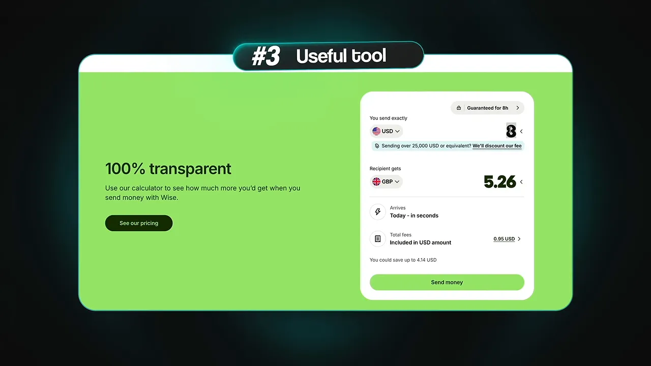
You have probably used that third category already. Wise offers a currency converter. Zillow lets people enter an address to get an estimated home value. Sherwin-Williams lets people upload a room photo and preview paint colors on their own walls. Amazon offers similar visualization for some products in a room.
These tools do not just describe value. They let someone experience a piece of it.
To find the right tool for a client, start with the questions customers repeatedly ask before buying. Pick one important question, decide what small interactive experience could answer it, and then ask Claude to build that into the site.
Review the Website Like a Business Owner
You do not need to stop using AI to build better websites. You need a better standard for deciding whether the output is good.
Before handing over a site, ask:
- Does the first screen make the audience, outcome, and next action obvious?
- Does the accent color make the primary action stand out?
- Do the layers create a clear hierarchy without covering important content?
- Does every animation do a useful job?
- Can someone get a small result before filling out a contact form?
Those questions move the conversation beyond “Does this look nice?” and toward “Does this help the business?”
That is what makes an AI website worth paying for. Not more effects, more sections, or more complicated prompts. A clearer message, more deliberate design, and a useful path from interest to action.


